White Card vs. Kraft Cardstock: Pros, Cons & How to Choose the right for your Product Packaging Design
When it comes to custom printing and packaging, the choice of material plays a crucial role in determining the final appearance of your design. Kraft and white cardstock are popular options, each offering unique aesthetics and characteristics. Although both of these substrates can be printed using the same techniques, the final results may vary significantly due to colour, texture, and ink absorption differences between the two cardstocks. Understanding these differences is essential in selecting the right type of material for your product packaging, branding, or marketing projects.
Why Printing Looks Different on White vs. Kraft Cardstocks?
The fundamental difference between printing on white and kraft cardstocks is driven by how the base cardstock colour affects ink appearance.
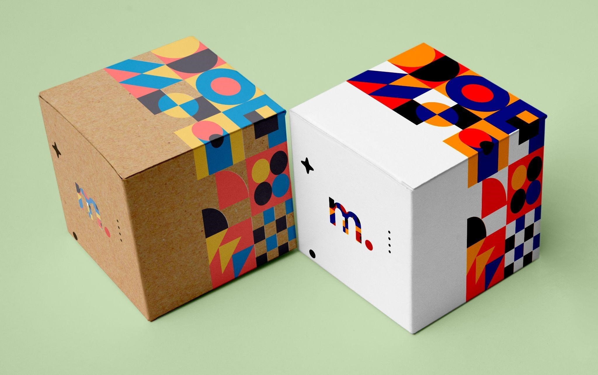
White Cardstock: Since white cardstock provides a neutral and bright background, colours appear vibrant, crisp, and true to the intended design. Printing on white cardstock is ideal for designs that require high colour accuracy and detailed artwork. Product boxes for premium brands are mostly made of white cardstock for crisp and bright results. White cardstock is commonly used for
Significance of White Ink in Kraft Card Printing
Due to the natural brown colour of kraft cardstock, lighter colours may appear subdued, while darker colours like black, navy, and deep green stand out more effectively. Since standard CMYK printing does not include white ink, achieving true colour accuracy on kraft paper can be challenging. To compensate for the inherent darker background of kraft paper, white ink can be used as a base layer beneath the design elements to enhance their vibrancy.
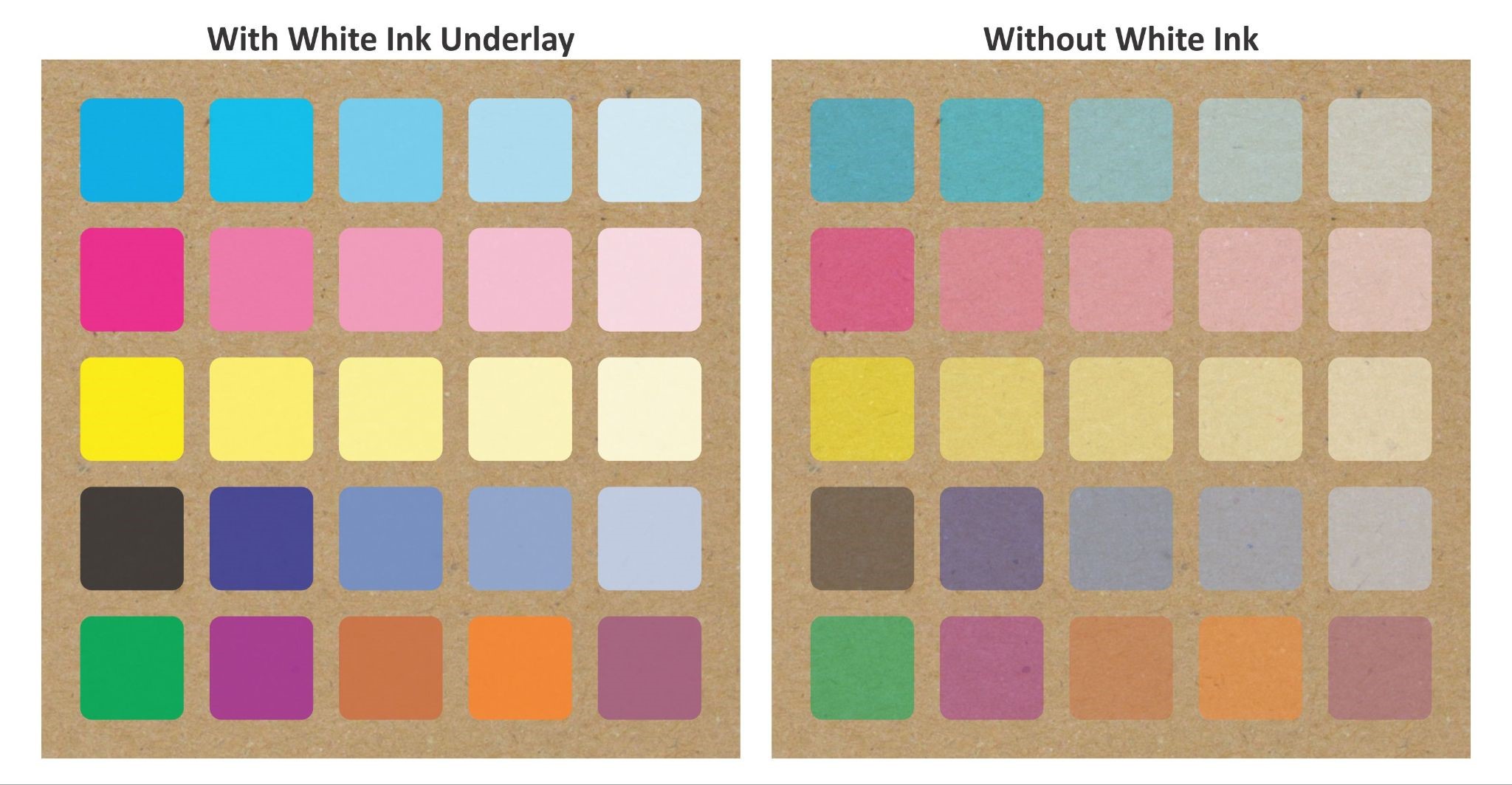
Without White Ink: When printing directly on kraft without a white ink base, the natural brown tone influences the colour output, resulting in a subdued, plain, or rustic aesthetic. This method is commonly used by brands that want to emphasize an organic, eco-friendly, or handmade aesthetic.
With White Ink Underlay: Applying white ink as a base layer before printing other colours allows the final result to pop, similar to how these colours would appear on white cardstock. This technique ensures higher colour accuracy and vibrancy, making it suitable for designs that require more precision and contrast.
Choosing between white and kraft cardstock involves more than colour; the material's texture also significantly impacts the final print quality and overall aesthetic. White cardstock comes in both coated and uncoated finishes. Coated white cardstock features a smooth surface that enhances ink vibrancy and sharpness, making it ideal for high-end packaging, luxury branding, and detailed artwork. In contrast, uncoated white cardstock has a softer, more natural feel, often selected for a classic and elegant appearance. Kraft cardstock, on the other hand, is naturally uncoated, resulting in a rougher texture that provides a more rustic feel.
Ultimately, whether you prefer the polished appeal of coated white cardstock or the earthy tactile feel of kraft cardstock, choosing the right material is crucial for ensuring your packaging aligns with your brand identity and leaves a lasting on your intended audience impression.
Professional Design & Printing Services
Printingblue offers customized commercial printing solutions to meet your business needs. Our expert team delivers top-notch design and printing services that exceed expectations. Contact us today for a free consultation.
